If you run macOS in dark mode, you've probably noticed the small inconsistencies: an app that mostly respects the system theme but renders one panel in stark white, or a popover that flashes bright before settling into place. Calendar-related UI is a common offender, since date pickers and event lists often default to light styling regardless of system settings.
For something meant to sit on screen continuously, visual consistency with the rest of your desktop isn't just aesthetic — a mismatched bright panel is genuinely distracting when everything else on screen is dark.
Why appearance consistency matters more for persistent UI
A calendar you open for two seconds and close can get away with a jarring color scheme — you barely register it. But a sidebar meant to sit at the screen edge all day needs to blend into your visual environment, not fight it. If it's the one bright rectangle on an otherwise dark screen, your eye keeps getting drawn to it even when you don't want to look.
This matters even more at night or in low-light environments, where a stray bright panel can actively strain your eyes.
A sidebar that matches your system
Dayedge follows your macOS appearance setting, rendering in dark mode when your system is set to dark and light mode when it isn't. The timeline is designed to sit quietly at the screen edge without becoming a visual outlier.
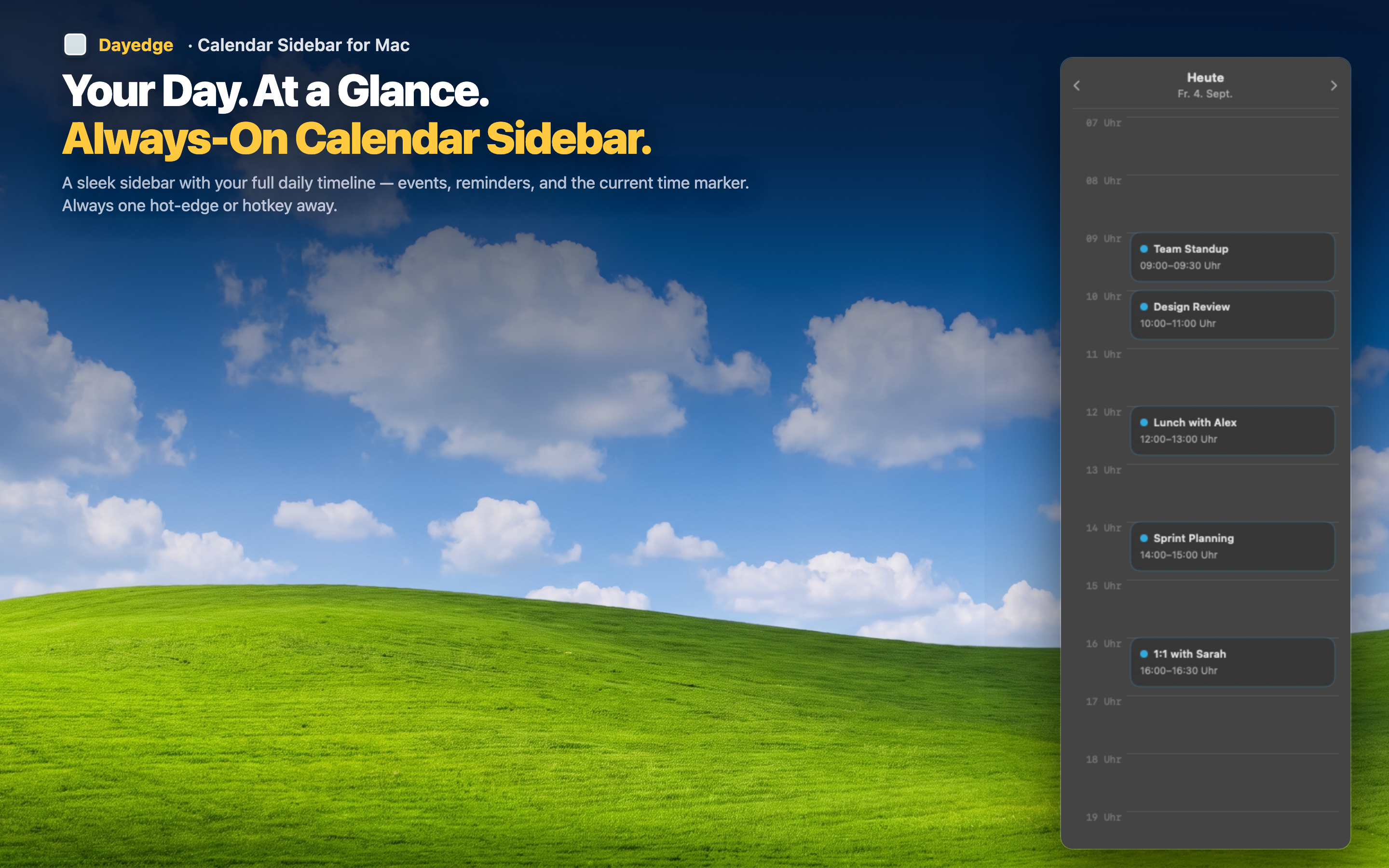
Consistent with your desktop
Since the sidebar is meant to be visible continuously, it's built to match rather than clash with the rest of your interface, whichever appearance mode you use.
Comfortable for long sessions
A dark, low-contrast timeline is easier on the eyes during long work sessions or evening hours than a bright white panel competing with a dark desktop.
Automatic, no manual toggling
The sidebar switches automatically alongside your system appearance setting — there's no separate dark mode toggle to remember or configure.