macOS widgets promise glanceability, but the calendar widget in Notification Center undercuts its own premise. To see it, you swipe in from the right edge or click the date in the menu bar. To go back to work, you swipe or click it away. That's two deliberate actions just to check what's on your schedule — not exactly glanceable.
Widgets were meant to reduce the friction of checking information. For calendar specifically, they've mostly just moved the friction from "open an app" to "open a panel."
Why the widget falls short during work
The calendar widget shows a short list of upcoming events with times, which is genuinely useful — when you can see it. The problem is visibility: Notification Center is hidden by default, and every time you want to check your day, you have to actively summon it. It doesn't stay open while you work in another app, so you can't leave it visible as a passive reference.
Widgets are also stacked with other widgets — weather, reminders, screen time — competing for the same panel. Finding your calendar widget among the stack adds another small delay.
A sidebar that stays open
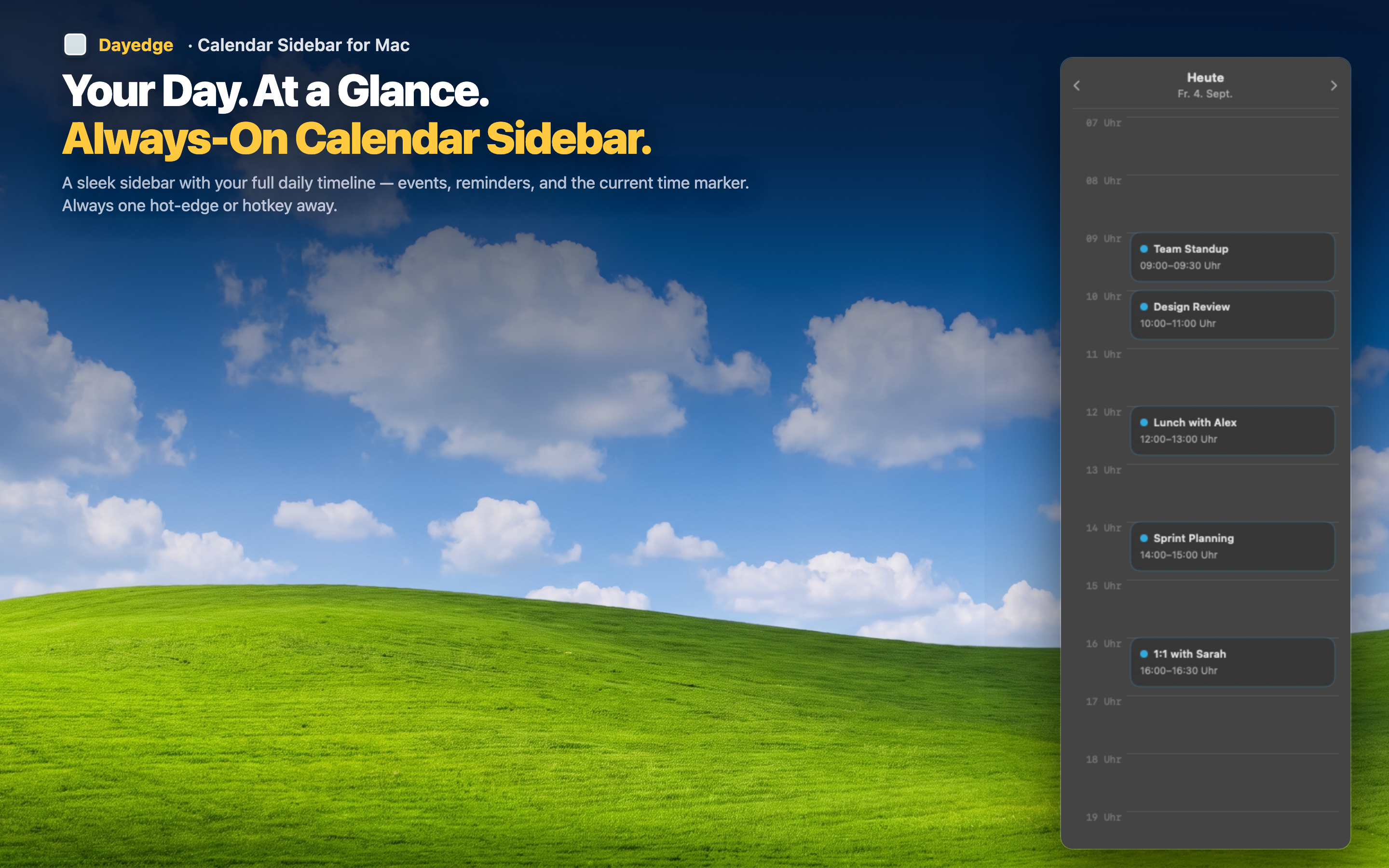
Dayedge solves the visibility problem directly: instead of a widget you summon, it's a sidebar that's simply there. Pinned to the screen edge, it shows your day as a continuous timeline that doesn't need to be swiped open or closed.
No panel to summon
Because the sidebar lives at the screen edge rather than inside Notification Center, there's no swipe gesture and no dismissal step. It coexists with whatever else is on screen, the same way a dock or menu bar does.
Dedicated to your schedule
Unlike a shared widget stack, the sidebar is dedicated entirely to your timeline — events and reminders together, sorted by time, with nothing else competing for attention.
Mini calendar included
Widgets typically show only a short list. A built-in mini calendar lets you jump to other dates without leaving the sidebar or opening a separate calendar app.