Meeter built a loyal following by solving one specific annoyance well: joining video calls quickly from a menu bar icon, without digging through Calendar. For people whose days are dominated by back-to-back Zoom and Meet calls, that alone was worth the download. But like any menu bar utility, it's constrained to the menu bar's format — a small icon, a dropdown list, and no persistent visual sense of how your day is shaped.
If quick meeting joins solved half your problem, the other half is still open: seeing your schedule as a whole, not just a dropdown list of upcoming calls.
What a dropdown list can't show you
A menu bar dropdown is inherently list-based — event names stacked vertically with times attached. It's great for the very next meeting, but it doesn't convey duration, gaps, or the overall texture of your day at a glance. You still have to read through the list to understand how busy the next few hours actually are, and the dropdown disappears the second you click elsewhere.
Meeting links plus a visual timeline
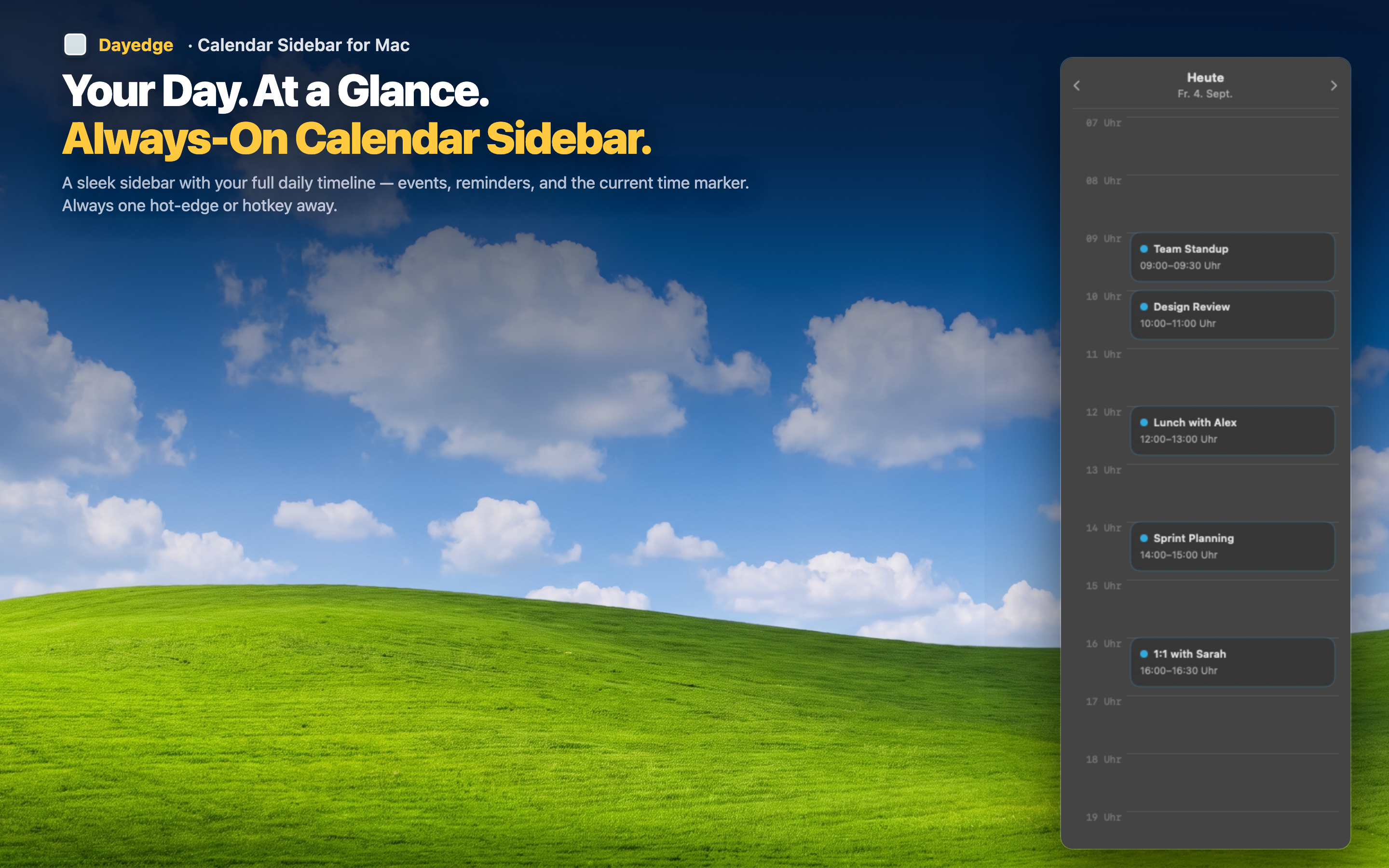
Dayedge keeps the one-click meeting join that made tools like Meeter popular, but presents it inside a persistent visual timeline instead of a dropdown. Event blocks are sized by duration and stacked chronologically, so you see the shape of your day, not just a list of names.
One-click join, same as before
Zoom, Google Meet, and Microsoft Teams links are detected automatically from your calendar events and surfaced as a direct join button — the core convenience carries over completely.
Always visible, not just on click
Instead of a dropdown that appears on click and disappears on click-away, the timeline sits pinned to the screen edge continuously, or reveals with a hot edge cursor gesture if you prefer a cleaner desktop.
See duration and gaps, not just a list
Because events are represented as sized blocks on a timeline rather than list rows, you get an immediate visual sense of how packed or open your day is — information a dropdown list doesn't naturally convey.