You have 25 apps in your Dock. At default size, it stretches across most of your screen. You drag the size slider down — now the icons are so small you can't distinguish them without squinting or hovering for tooltips. You drag it back up — now the Dock takes a third of your screen width and the icons bounce around with magnification enabled.
The Dock's size problem isn't about the slider. It's about the architecture: one row of icons that has to show everything at once.
The scaling problem
The Dock was designed for a handful of apps. When Mac users had 8-10 apps pinned, the sizing worked fine. But modern workflows involve dozens of tools. The single-row design forces a tradeoff between icon readability and screen real estate that gets worse with every app you add.
macOS offers magnification (icons grow when you hover over them), but this causes the Dock to shift and resize constantly, making it harder to click the right icon. It solves the "too small" problem by creating a "too jumpy" problem.
Stop scaling, start organizing
Jetty sidesteps the sizing problem entirely. Instead of cramming everything into one row and fighting with the size slider, you distribute your apps across multiple panels in the menu bar. Each panel shows a manageable number of icons at a comfortable size.
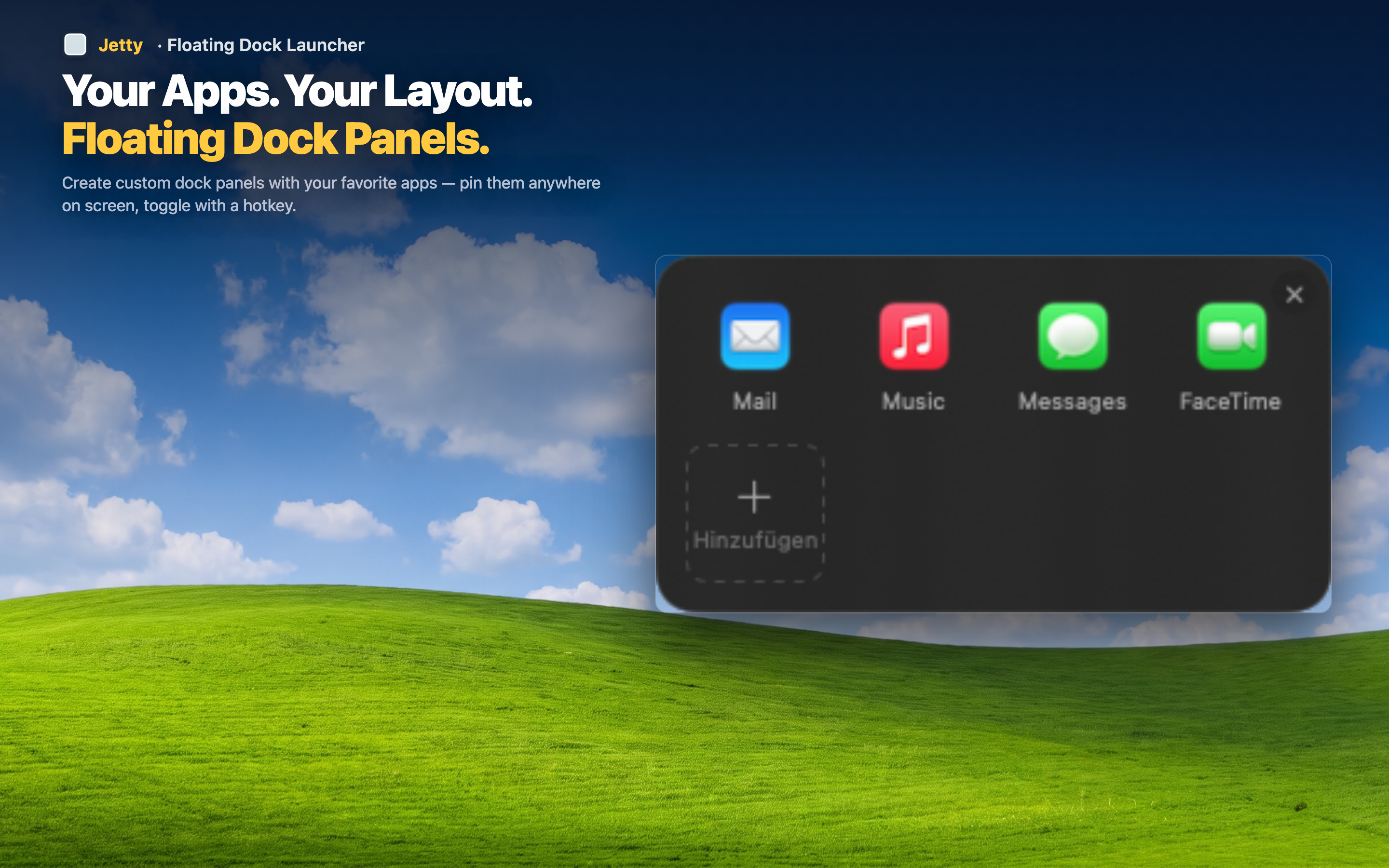
Comfortable icon sizes
With 6-8 apps per panel instead of 25 in one row, every icon is large enough to recognize instantly. No magnification needed, no squinting, no guessing.
Minimal Dock, maximum access
Keep your Dock small with just the 3-4 apps you use constantly (Finder, a browser, maybe your main work app). Everything else goes in Jetty panels. The Dock stays small and clean. You keep full access to everything.
No screen space wasted
Jetty panels only appear when you click the menu bar icon. The rest of the time they take up zero screen space. Compare this to a large Dock that's permanently eating into your workspace, or an auto-hiding Dock that adds delay every time you need it.